 ziyarago/ui
Avatar
Circular user picture that falls back to initials. The size prop (xs, sm, md, lg, xl) sets the diameter (24 / 32 / 40 / 56 / 72 px; a number in px still works).
Import
Vue
import { UiAvatar } from '@ziyarago/ui/vue'Initials
AKFNY
Vue
<UiAvatar name="Ahmed Khan" />

<UiAvatar name="Fatima Noor" :size="56" />

<UiAvatar name="Yusuf" :size="72" />
Image
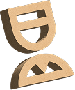
Vue
<UiAvatar name="Guide" src="/3d/guide.png" :size="64" />
Sizes
AKAKAKAKAK
Vue
<UiAvatar name="Ahmed Khan" size="xs" />

<UiAvatar name="Ahmed Khan" size="sm" />

<UiAvatar name="Ahmed Khan" size="md" />

<UiAvatar name="Ahmed Khan" size="lg" />

<UiAvatar name="Ahmed Khan" size="xl" />
API reference
Round user picture that falls back to initials when there is no image.
Props
PropType and valuesDefaultDescription
namestring—Full name. Shown as the tooltip and used for up to two initials; "?" when empty.srcstring—Image URL. Initials are shown without it.initialsstring—Explicit initials (up to 3 characters, uppercased) instead of the ones derived from name.tonebrandskysuccesswarningdangerneutral'brand'Background color of the initials avatar.shapecirclerounded'circle'rounded gives a squircle with a 30% corner radius.ringbooleanfalseAdds a background-colored ring so overlapping avatars stay separated.statusonlineofflineawaybusy—Shows a presence dot in the bottom corner.sizexssmmdlgxl'md'Diameter: xs 24, sm 32, md 40, lg 56, xl 72 px. A number is used directly as px.Notes
- Avatar sizes differ from other components (lg 56, xl 72), and a number gives any custom size.